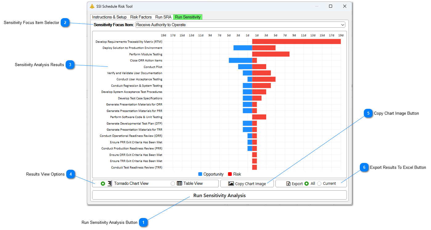
Click this button to run a Sensitivity Analysis for the Key Events flagged. The Sensitivity results views and related controls remain hidden until a Schedule Risk Assessment has been successfully completed.
The value selected in this drop-down menu specifies which Key Event results are displayed. All tasks identified as Key Events (that is, tasks with a value of Yes in the specified Key Event Flag field) are available for selection. Choosing a different Key Event updates the displayed results without requiring the Sensitivity Analysis to be rerun.
This section displays the results of the Sensitivity Analysis for the currently selected Focus Item. Results can either be displayed in a Tornado Chart or a Table.
Tornado Chart
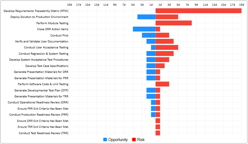
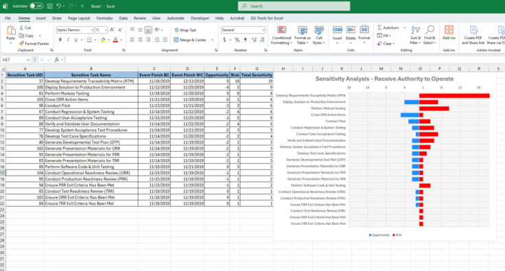
In Tornado Chart view, Each bar in the chart represents the effect of a single Task, Risk, or Opportunity when evaluated independently. The red bars extending to the right represent how much risk that item has to delay the Key Event. The blue bars extending to the left represent the amount of opportunity that item has to accelerate the Key Event. The length of each bar corresponds to the amount of schedule movement caused by that item.
Items are sorted by impact, with the most influential items appearing at the top of the chart and the least influential items appearing at the bottom. This arrangement gives the chart its characteristic "tornado" shape.
Results Table
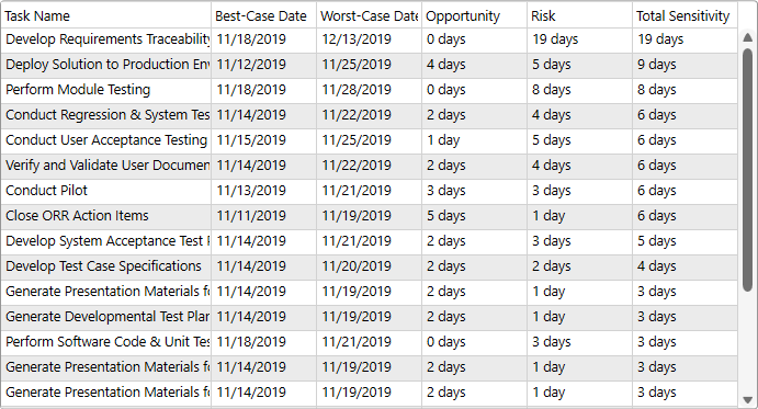
The results table contains the underlying data used to generate the Tornado Chart. Each row corresponds to an item with sensitivity to the selected key event.
The results table contains the following columns:
• Task Name – The name of the activity, Risk, or Opportunity that was has sensitivity.
• Best-Case Date – The resulting completion date of the selected Key Event when the item is evaluated using its Best-Case duration estimate or when an Opportunity is realized.
• Worst-Case Date – The resulting completion date of the selected Key Event when the activity is evaluated using its Worst-Case duration estimate or when a Risk is realized.
• Opportunity – The number of schedule days the Key Event would be accelerated relative to its current finish. Larger values indicate greater potential to improve the Key Event completion date.
• Risk – The number of schedule days the Key Event would be delayed relative to its current finish. Larger values indicate a greater potential to adversely impact the Key Event completion date.
• Total Sensitivity – The combined schedule impact of the item, calculated as the sum of the Opportunity and Risk values. This metric is used to rank activities within the Sensitivity Analysis and represents the total range of schedule movement that the activity can introduce to the Key Event.
Click this button to copy the Tornado Chart to the clipboard. This image can then be pasted in external applications. This button can only be pressed while in Tornado Chart View.
Click this button to export the Sensitivity Analysis results to an Excel workbook. The exported workbook includes the data displayed in the Results Table, along with a Tornado Chart representation of the results for the selected Key Event.
If All is selected when this button is pressed, results for every Key Event included in the analysis are exported to separate worksheets within the workbook.