How SRA Results are Calculated
Once task durations have been determined and any applicable Risks and Opportunities have either been realized or not for the current iteration, the tool simulates the calculation of the schedule and determines the resulting dates for each Key Event. These resulting dates are recorded, and the entire process is repeated for the specified number of iterations. As additional iterations are completed, the tool builds a statistical distribution of possible completion dates for each Key Event. This distribution is then used to calculate the probability of achieving a Key Event on or before a specific date.
| | Running a Schedule Risk Assessment or Sensitivity Analysis with the SSI Schedule Risk Tool does not alter the Microsoft Project schedule. The SSI Schedule Risk Analysis Tool performs all analysis calculations without writing data back to the project file, ensuring that the schedule remains unchanged throughout the analysis process.
|
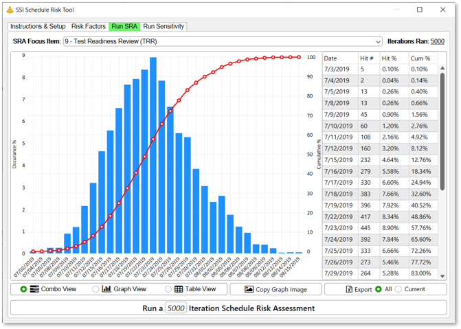
The results of a Schedule Risk Assessment are presented in two components: a dual-axis graph and a results table. Together, these components provide both a visual summary of the assessment results and the detailed data used to generate them.
The SRA Graph
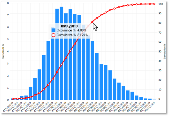
The SRA graph is a dual-axis graph that displays the range of possible completion dates for the selected Key Event and the probability associated with those dates. The horizontal axis represents potential completion dates
The graph contains two data series:
• Histogram (Frequency Distribution): The vertical bars represent the percentage of simulation iterations that resulted in the Key Event completing on a specific date. The left vertical axis shows the occurrence percentage.
• Cumulative Probability Curve: The line represents the cumulative probability of completing the Key Event on or before a given date. The right vertical axis displays this probability as a percentage.
The Results Table
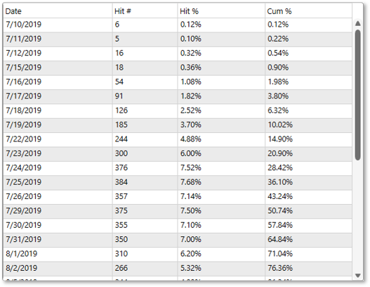
The results table contains the underlying data used to generate the graph. Each row corresponds to a completion date identified during the assessment.
The results table contains the following columns:
• Date – The simulated completion date for the selected Key Event.
• Hit # – The number of simulation iterations that resulted in the Key Event completing on that date. For example, a value of 300 indicates that the Key Event completed on that date in 300 separate simulation iterations.
• Hit % – The percentage of total simulation iterations that resulted in the Key Event completing on that date. This value corresponds to the histogram displayed in the results graph. For example, a Hit % of 6% indicates that 6% of all simulation iterations produced that completion date.
• Cum % – The cumulative probability of the Key Event completing on or before the specified date. This value corresponds to the cumulative probability curve displayed in the results graph. For example, a Cum % of 50% indicates there is a 50% probability that the Key Event will complete on or before that date.